

Choosing the perfect color for track lighting can transform any space with just the right touch.
To choose the perfect color for track lighting, start by considering the room's purpose, the availability of natural light, and the ambiance you want to create. Neutral colors like black, white, or silver are versatile, while custom shades can amplify branding efforts. Don't forget to consider finishes—matte options often give a sleek, professional appearance ideal for commercial settings.
When I first started exploring lighting solutions, I was surprised at how much a simple color change could alter a room's vibe. Think about it: a cozy reading nook might benefit from warm hues, while a vibrant kitchen could shine with cooler tones. If you're managing a commercial space, remember that custom colors not only reflect your brand but also leave a lasting impression on visitors. Plus, choosing the right finish—whether matte for that understated elegance or something glossier—can make all the difference. It's these thoughtful decisions that turn functional lighting into an integral part of your design story.
Neutral colors are best for track lighting versatility.True
Neutral colors like black, white, or silver suit various settings.
Custom colors in track lighting limit branding opportunities.False
Custom colors enhance branding by aligning with brand identity.
What Role Does Color Temperature Play in Track Lighting?
Ever stared at a room and felt something was just... off? Turns out, the secret could be in the color temperature of your lighting!
Color temperature in track lighting is crucial because it defines the ambiance and functionality of a space. Warm hues (2700K-3000K) create a cozy, inviting atmosphere, while cooler tones (4000K-6500K) enhance focus and visibility, perfect for workspaces.
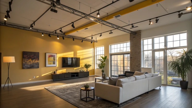
Understanding Color Temperature
I remember walking into a friend's living room that felt as welcoming as a bear hug, thanks to the soft, warm lighting. It turns out, this magic was all about color temperature, measured in Kelvin (K). In track lighting, warm colors around 2700K-3000K give you that cozy, incandescent glow that feels like home. On the flip side, cooler colors ranging from 4000K to 6500K mimic daylight—perfect for workspaces where keeping alert and focused is key.
Effects on Mood and Productivity
I've noticed that when I'm in a room with warmer lighting—think about those cozy cafes with soft lighting—my stress melts away, and I can relax. Warmer temperatures are perfect for places where you want to unwind or create a sense of intimacy, like living rooms or restaurants1. But when it's time to roll up my sleeves and get things done, cooler temperatures are my go-to. They help sharpen clarity and boost cognitive performance in offices or classrooms2.
Balancing Functionality with Aesthetics
Finding the sweet spot between function and style in lighting is like mixing the perfect cocktail—it's all about balance. Combining warm and cool lights can create distinct zones for different activities within the same space. Here’s a quick cheat sheet I often refer to:
| Space Type | Recommended Temperature | Purpose |
|---|---|---|
| Living Room | 2700K - 3000K | Relaxation, Cozy Atmosphere |
| Office | 4000K - 5000K | Focus, Productivity |
| Kitchen | 3000K - 4000K | Clarity, Visibility |
| Retail | 3500K - 5000K | Highlighting Products |
This table helps me visualize how the right lighting can transform spaces, tailoring them to specific needs while boosting both productivity and satisfaction.
Choosing the Right Bulbs
When picking bulbs for track lighting, I don’t just consider wattage. It's about how each bulb affects color temperature. LED bulbs are my favorite—they’re versatile and energy-efficient. Plus, opting for dimmable bulbs gives me the flexibility to adjust lighting depending on the time of day or activity.
For those like me who love diving deeper into making the most out of track lighting, check out our comprehensive guide3. It's full of insights to help you create spaces that not only look good but feel right too.
Warm light (2700K-3000K) enhances relaxation.True
Warm light evokes coziness, suitable for relaxing spaces like living rooms.
Cool light (4000K-6500K) reduces productivity.False
Cool light improves focus and clarity, boosting productivity in workspaces.
How Do Neutral Shades Enhance Versatility?
Ever walked into a room and felt instantly at ease, yet couldn't quite put your finger on why? That’s the magic of neutral shades at work.
Neutral shades enhance versatility by creating a flexible backdrop that adapts to various styles and patterns. They allow for effortless style updates and offer a cohesive look across diverse elements.
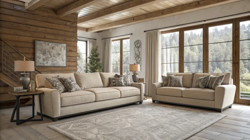
The Power of Neutral Shades in Design
I remember the first time I experimented with neutral shades in my home. I had just moved into a new apartment, and my budget was tight. The walls were this bland beige, and at first, I thought I'd paint them something bold. But then, a friend suggested I keep them as they were, saying they could be my blank canvas. So, I decided to give it a shot.
Neutral shades like beige, gray, and taupe are celebrated for their ability to complement any design aesthetic4. These colors provide a backdrop that allows other elements to shine, creating a balanced and harmonious space.
| Shade | Effect | Typical Use |
|---|---|---|
| Beige | Warmth | Living Rooms |
| Gray | Modernity | Offices |
| Taupe | Earthiness | Bedrooms |
Creating Cohesive Spaces
Using neutral colors helps in achieving a cohesive look across various design elements. Whether in furniture5 or wall paint, these shades tie different pieces together, making it easier to switch out seasonal decor or add pops of color.
I remember hanging a vivid painting on my soft gray wall, unsure how it would look. To my surprise, the wall's neutrality made the artwork pop without clashing with anything else in the room. Suddenly, my space was full of possibilities.
Flexibility Across Styles
Neutral shades are not confined to any particular style. They fit perfectly in minimalist interiors, providing a calming6 atmosphere. Meanwhile, in eclectic spaces, they act as a unifying force among diverse patterns and textures.
I often find myself rearranging my furniture or swapping out accessories when I crave a change. With neutral-toned large furniture pieces, transitioning between modern and traditional styles became effortless.
Practicality in Commercial Spaces
In commercial settings, the versatility of neutral tones extends beyond aesthetics to practicality. Neutral colors are often used in office spaces to create an environment that is both professional and inviting. The choice of a neutral palette can also influence lighting7 choices, enhancing natural light while reducing glare from artificial sources.
For businesses I've worked with, this adaptability can lead to cost savings over time. As trends evolve, the foundational elements remain relevant, avoiding the need for frequent and costly updates to align with current styles.
Conclusion
The role of neutral shades in enhancing versatility is evident across both residential and commercial spaces. They offer a blend of style flexibility and practical benefits that support dynamic environments. As design preferences evolve, the timeless appeal of neutrals remains a constant ally in achieving desired aesthetics without compromising on functionality.
Neutral shades fit all design styles.True
Neutral shades adapt to any design style, offering versatility and cohesion.
Gray walls limit decor options.False
Gray walls enhance decor flexibility by allowing vibrant additions without clashing.
How Can Custom Colors Reflect Your Brand Effectively?
Ever wondered how a splash of color could transform your brand?
Custom colors can be a powerful tool for branding by aligning with your core values and appealing to your audience's preferences. They enhance recognition and set you apart in a crowded market. Using color psychology strategically can evoke the right emotions and perceptions.
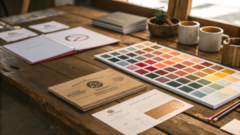
The Power of Color Psychology
I remember when I first started exploring the idea of custom colors for my brand. It felt a bit like picking a new outfit—exciting but slightly overwhelming. Colors are more than just visual appeal; they speak a language of emotions. For instance, blue feels like a warm embrace, reassuring and trustworthy, much like how I hope clients feel about working with us. Red, on the other hand, ignites a spark of passion or urgency, perfect for moments when you need to capture attention immediately. Understanding these subtle messages helps in crafting a color palette that resonates deeply with your brand's spirit.
| Color | Emotion | Brand Examples |
|---|---|---|
| Blue | Trust | Facebook, IBM |
| Red | Passion | Coca-Cola, YouTube |
Differentiation Through Custom Colors
In the bustling market we find ourselves in, standing out isn’t just an option—it’s a necessity. Take T-Mobile, for example, with their bold choice of magenta. It’s not just a color; it’s their signature, a beacon in the sea of sameness. Similarly, selecting unique colors for my brand has been like adding a personal signature to everything we create. This choice not only enhances recognition but also builds loyalty as customers begin associating those hues with the quality and values we promise.
Explore differentiation strategies8 using color to enhance brand recognition and loyalty.
Aligning Colors with Brand Values
A few years ago, I decided to align our brand colors with our commitment to sustainability. Green was the obvious choice, symbolizing growth and eco-friendliness—a direct reflection of our environmental values. Aligning our color choices this way has ensured that every interaction with our brand reinforces this message. It’s about more than aesthetics; it’s about authenticity and coherence across all platforms.
Learn how successful brands have utilized color alignment9 to strengthen their market position.
Custom Colors in Digital Spaces
Adapting to digital spaces can be tricky. Colors don’t just sit pretty; they shift and morph across different devices and screens. When I first encountered this challenge, it was clear that employing adaptive and responsive color schemes was the way forward. By staying ahead of digital color trends, I ensure our brand remains fresh and relevant in this ever-evolving landscape.
Discover innovative digital color trends10 for keeping your brand vibrant and engaging across platforms.
Blue is associated with passion and urgency.False
Blue is typically linked to trust and reliability, not passion.
T-Mobile uses magenta to differentiate its brand.True
T-Mobile is known for its distinctive use of magenta in branding.
Why Opt for Matte Finishes in Commercial Spaces?
Ever wondered why matte finishes are becoming the go-to choice for commercial spaces?
Matte finishes in commercial spaces offer low reflectivity, concealing imperfections and minimizing glare. They create a sophisticated, professional atmosphere and are versatile, complementing various design themes while being low maintenance.
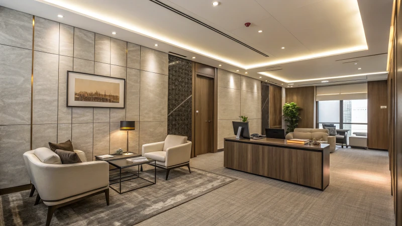
I remember the first time I walked into a newly designed office space that used matte finishes throughout. The walls had this understated elegance, a quiet confidence that seemed to whisper professionalism without shouting. It was like the difference between a loud, brash party and a sophisticated gathering where you just felt the quality all around you. That's the magic of matte.
Enhanced Aesthetic Appeal
Matte finishes provide a modern, sleek look that appeals to contemporary design preferences. Their subtle nature ensures that they don't overshadow other design elements, creating a cohesive atmosphere. In commercial spaces, where first impressions11 matter, a matte finish can project sophistication and professionalism.
Practical Benefits: Concealment and Maintenance
One of the standout features of matte finishes is their ability to conceal wall imperfections, such as dents or scratches, which are common in high-traffic areas. This makes them ideal for commercial environments where maintaining a pristine look is essential. Additionally, matte surfaces tend to show fewer fingerprints and smudges, reducing the need for frequent cleaning, which can be a time-saving advantage for businesses.
Versatility in Design
Matte finishes complement various color schemes, making them adaptable to different branding or thematic requirements. Whether using neutral shades like black or white12 or opting for custom colors for branding, matte finishes offer flexibility without sacrificing style.
| Color | Usage | Impact |
|---|---|---|
| Neutral Tones | Office Spaces | Creates calm, professional settings |
| Custom Colors | Retail Environments | Enhances brand recognition |
| Pastels | Hospitality (Hotels, Cafes) | Invites warmth and comfort |
Adaptability to Lighting Conditions
In commercial spaces, lighting can dramatically affect the ambiance. Matte finishes do not reflect light as much as glossy ones, minimizing glare and allowing for better lighting control13. This adaptability is especially beneficial in settings like restaurants or offices where lighting needs may change throughout the day.
Matte finishes conceal wall imperfections well.True
Matte surfaces hide dents and scratches, ideal for high-traffic areas.
Matte finishes increase the need for cleaning.False
Matte surfaces show fewer fingerprints and smudges, reducing cleaning frequency.
Conclusion
Choosing the right color for track lighting enhances ambiance and functionality, balancing aesthetics with purpose. Consider neutral shades, color temperature, and finishes for optimal results in various spaces.
- Explore how warm lighting enhances dining experiences by creating cozy atmospheres. ↩
- Learn how cool lighting improves focus and visibility in educational settings. ↩
- Discover how to choose the right track lighting for any setting, maximizing both efficiency and aesthetics. ↩
- Explore how neutral shades enhance design aesthetics across various styles. ↩
- Discover how neutral furniture enhances style cohesion in rooms. ↩
- Learn about the soothing impact of neutrals in minimalist spaces. ↩
- Understand how neutrals influence lighting choices in commercial areas. ↩
- Learn from case studies of brands that have successfully used unique colors to stand out in their industries. ↩
- Understand the strategies brands use to ensure their color schemes reflect their fundamental values. ↩
- Stay updated with emerging digital color trends that can keep your brand relevant and engaging. ↩
- Understanding how first impressions affect customer perception can help in choosing the right interior finishes. ↩
- Discover how neutral colors contribute to a professional and versatile interior design. ↩
- Explore how controlling lighting can enhance the functionality of commercial environments. ↩